Revamping the mental model of donating to support a child’s education
I joined the marketing team at The Citizens Foundation (TCF) in 2017, and over the years my role shifted between various responsibilities. As a scrappy backoffice team at a non-profit organization, we wore multiple hats and I was fortunate to gain experience in different roles along the entire marketing stack. My first and probably longest running role in the team was optimizing the online donations process.
My role
Project lead + UX researcher + UI Designer + Developer
Other team members:
- Tazeen Saleem: Team lead
- Khawar Ali: UI Designer
- Ashok Malhi: Developer
Time period: 2017-2020
The Challenge
Donors found TCF’s online donation forms to be slow, cumbersome, and difficult to understand. Some who preferred to give online ended up having to donate through other means due to the lack of choices, and on the flip side the organization did not have any data to help make improvements.
The Solution
Conducting primary research and industry analysis to understand how donors prefer to give online, and using that learning to redesign the online donation form.
Background
TCF was one of the first non-profits in Pakistan to begin accepting donations online at a time when ecommerce and online payments in general were extremely limited in the consumer sector. There was only one payment processor available in the market, and the integrations required to work with them required a series of restrictive technical implementations and legal paperwork. As a result, only a handful of software products existed that could be used to integrate with payment systems in Pakistan. The experience was even more limited when it came to donations.
But the benefits were evident. Even with a simplistic donation flow, the organization saw significant growth in small- to medium-sized (“retail”) donations from across Pakistan as well as from expats in other countries who could now easily donate online.
As the organization grew, they wanted to continue as well as further understand this growth but were limited by the technical capabilities and design of the payment platform being used.

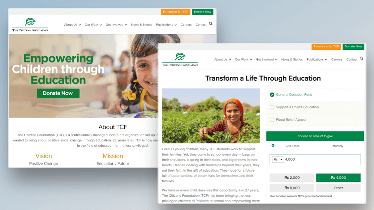
The donation forms were hosted by a 3rd party service, which severely limited creative options and user experience. The donation flow involved a long and cumbersome form which was not mobile optimized, multiple redirections, and long leadtimes when requesting changes.

Donation options were laid out like a menu of products, with certain pre-defined price points. This led to many inquiries where donors could not figure out how to donate in an amount of their own choosing.
Finally, with no digital analytics data to track online conversions, the team could only rely on sessions data to gauge marketing effectiveness. When making marketing decisions, the team was forced to rely on guesswork.
Tweaking the mental model
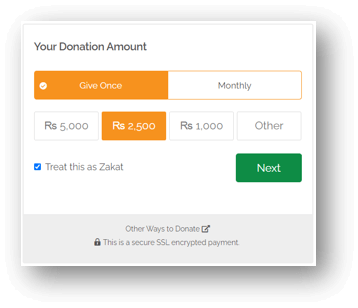
TCF’s online donation forms were designed as “products” with defined prices that donors could “purchase”. However from user interviews conducted with first-time as well as repeat online donors, we learned that they overwhelmingly preferred to donate by entering their own amounts, such as donation Rs. 500, rather than selecting a “product” with a fixed, TCF-defined price to support, such as the education of a child for a year for Rs. 1,400.
This dissonance stemmed from the difference in mental models when it comes to purchasing a product, versus making a donation of some amount of money that the donor is comfortable with at that point of time.

Further user observations and anonymous session tracking recordings showed people got confused with the form options, scrolling up and down the page multiple times, or not being able to find the ‘Next’ button, resulting in a high abandonment rate. Donors complained about the unnecessarily long donation form that asked for too many details.
Implementation Challenges

With the learning gathered from our own research and observing industry best practices, we were able to start mocking up different versions of a simpler donation form. This would be
- Built with the model of donors entering their own donation amounts rather than limiting donors to a list of price points.
- Visually refreshed to make it more appealing.
- Divided into multiple steps so that donors did not become overwhelmed at first glance.
- Integrated with Analytics software so we could correlate source and traffic data with the online revenue.
- Hosted on our own website to prevent breaking the user experience by redirecting to a third-party form.
Resources, capabilities, and experience of web design were limited. Many of the technically proficient talent was more interested in lucrative outsourced contracts that a non-profit could not compete with and finding the right development partner was a challenge.

The redesigned form resulted in a drastic improvement in loading time. We did not have comparative conversion data, but mobile sessions increased from 42% to 62% in the period after this change. Annual YoY growth maintained at 55% from FY 2017 to 2018.
Users who were asked for feedback on the redesigned form commented on how the visuals helped them relate their donation to the impact they could create through their donation, how much clearer the donation process was, and how they appreciated being able to donate whatever amount they were comfortable with.
Iterating on Donation Products
As a next step next year, we developed a donation form inhouse rather than utilizing the third-party service. This allowed us complete control of the user experience as well as freedom to test and modify aspects with greater freedom.

We wanted to revisit the idea of donating in
Some design refinements were also made, and we introduced an alternative form which based the amount on the impact. Instead of asking donors what amount they wished to donate, this form asked how many children’s education they wanted to support.
Over time we continued making further refinements to the design and writing on the form. Further options were added, giving donors the ability to designate the type of donation (as a religious accommodation or a general donation), as well as the option to choose different currencies in which to donate.

Much of the learning and insights from this process helped guide our work on the next phase of growth for online donations at TCF, which was to build a peer-to-peer donation platform for the different countries where TCF operated.